identity design
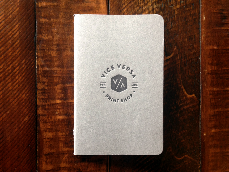
Vice Versa Print Shop
After slowly building up my letterpress print shop over the last few years, I finally carved out the time to finish up branding. Very excited to have launched Vice Versa Print Shop in 2014.
Vice Versa calls to mind the nature of working with reversed elements when relief printing. I wanted a logo that would print well at small sizes with one color letterpress and look the same when viewed upside down/right side up.
Check out the full site: vvprintshop.com
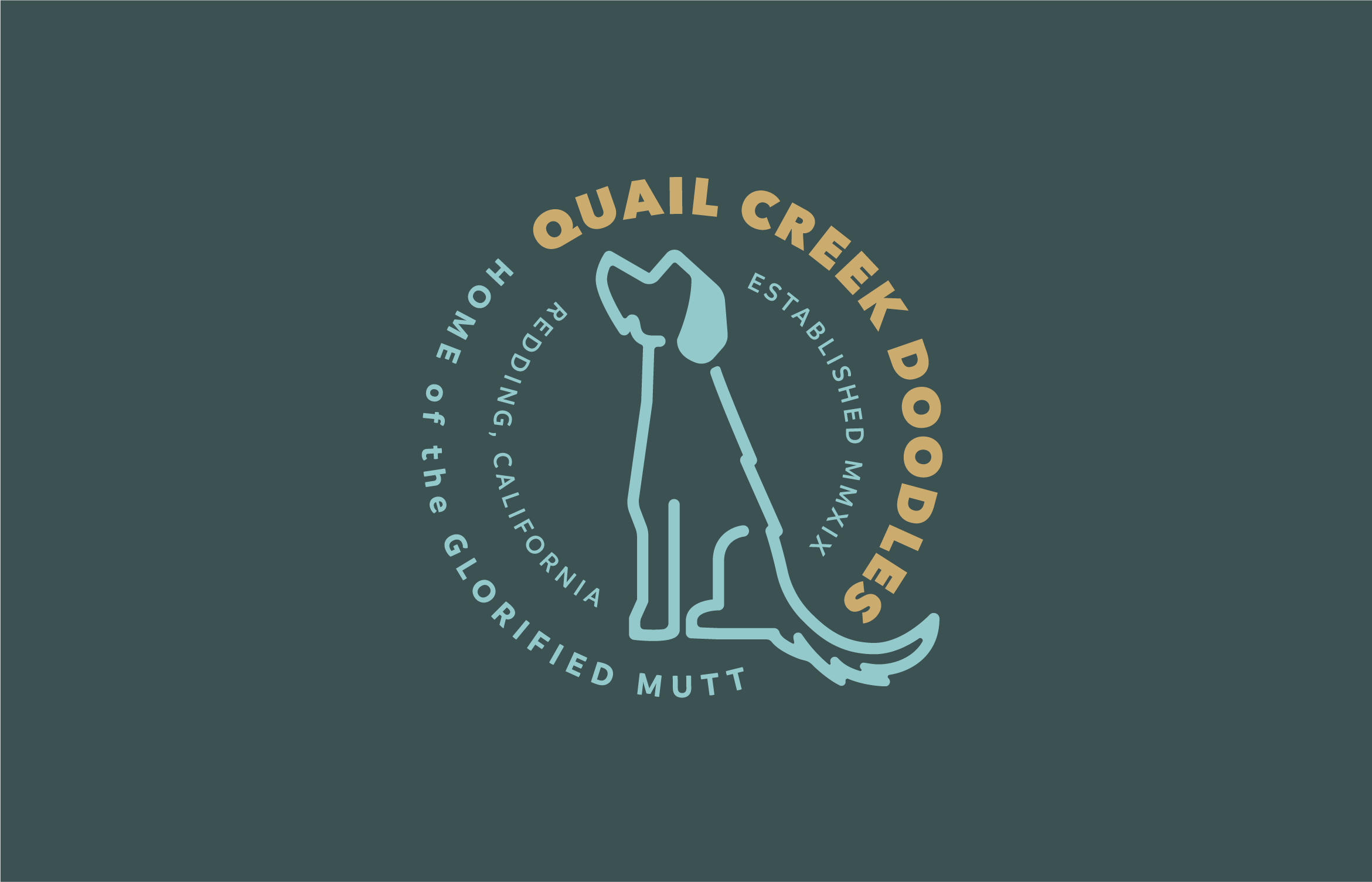
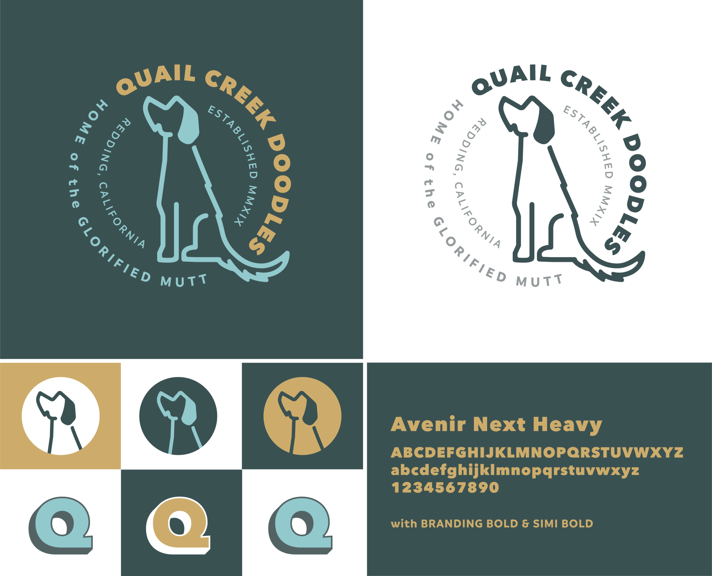
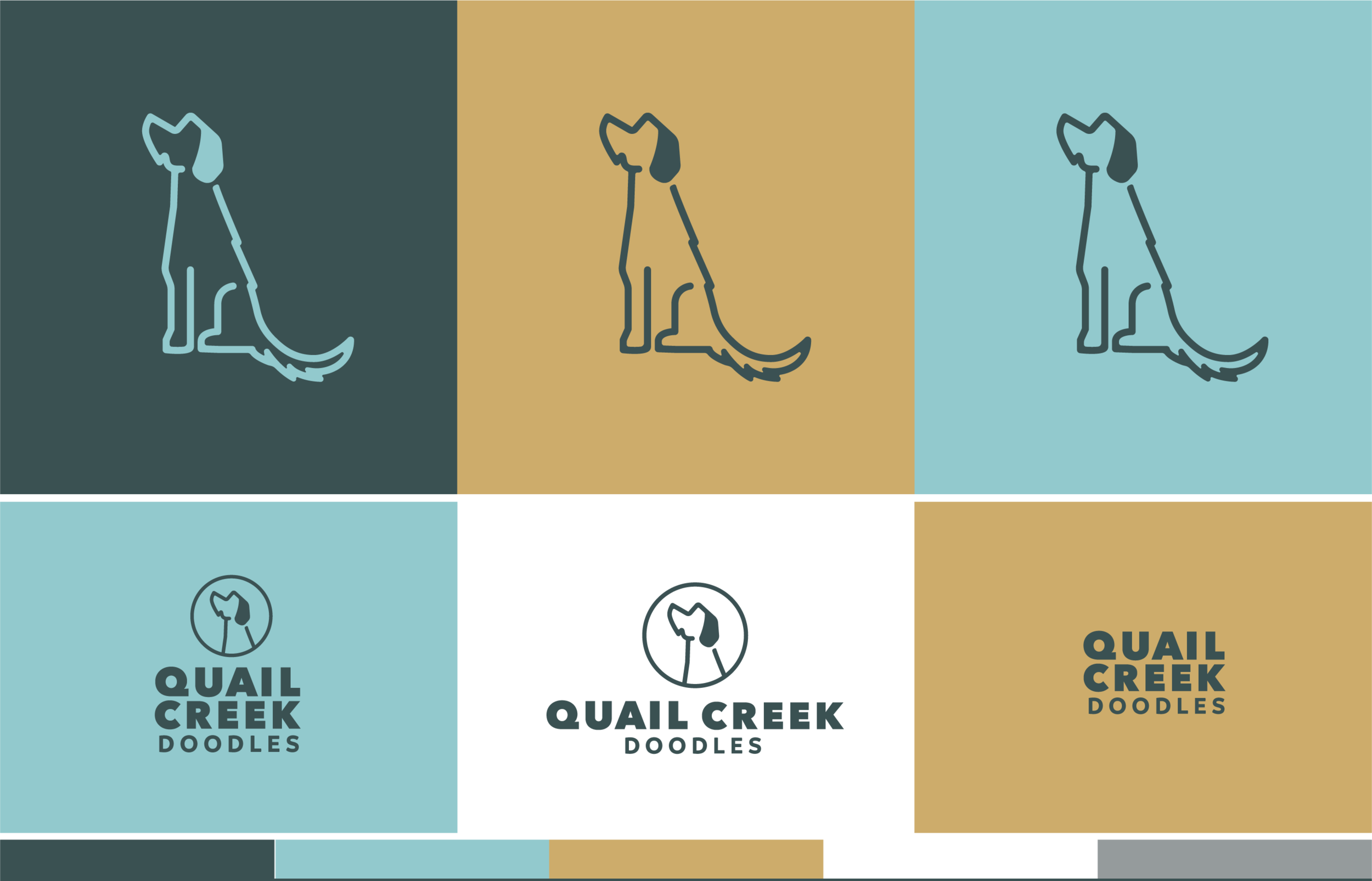
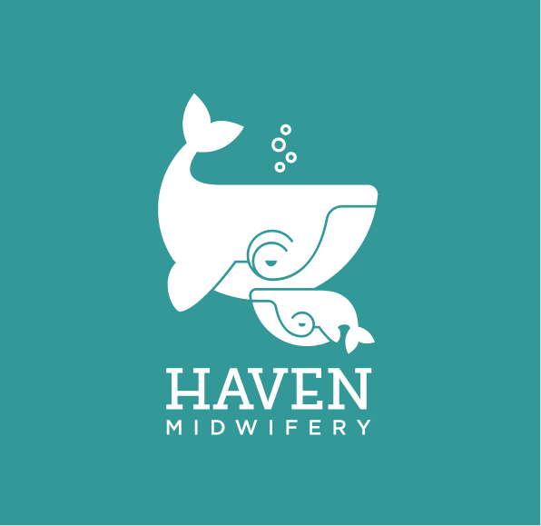
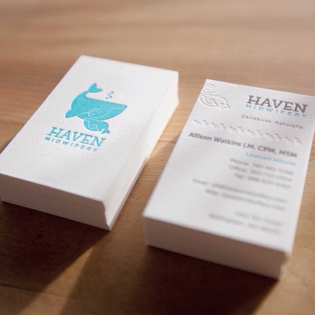
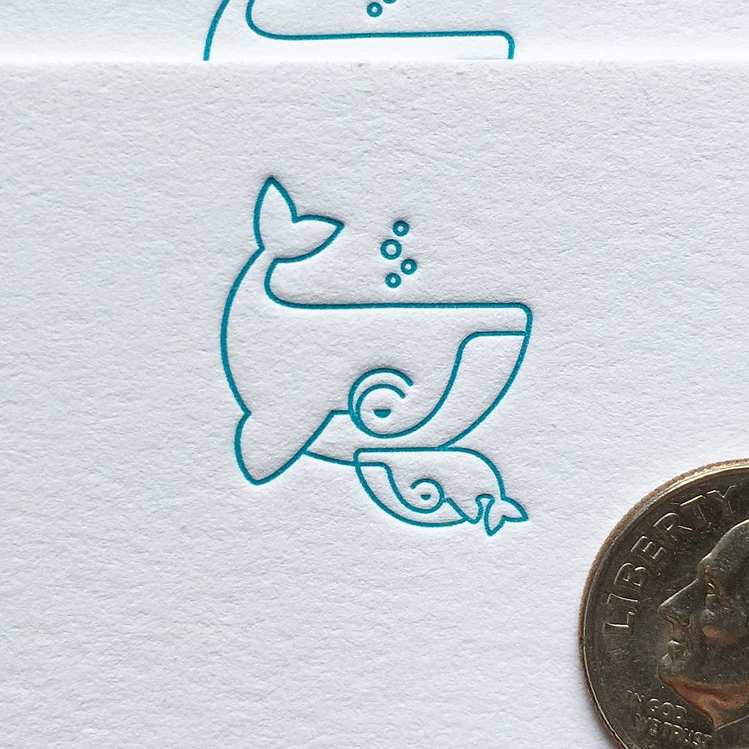
Haven Midwifery
The goal was to create a friendly and modern identity that pays respect to one of the oldest professions while being accessible to the uninitiated. It just so happens that whales have the second longest gestational period of all mammals, they often have another whale assisting as a midwife of sorts and of course they have water births.
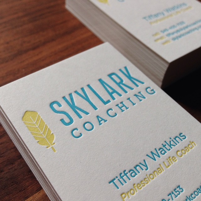
Skylark Coaching
When branding Skylark Coaching, the challenge was to achieve accessibility, friendliness and a steadfastness of sorts for the brand. I paired a light and modern san serif complimented by a sturdy slab serif for the word mark. Supporting the wordmark is a feather icon giving a nod to bird imagery in a fresh way while hinting at the lightness achieved through the process of life coaching. The choice of brand colors further supports the friendliness and openness that is a hallmark of Skylark's services.
The raised details of the feather icon is a fun surprise when printing with letterpress.
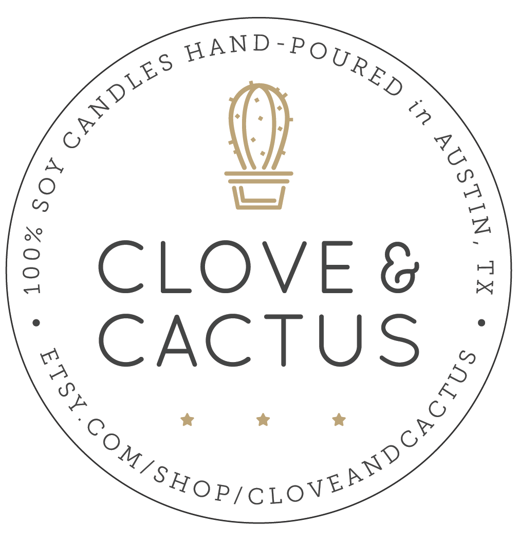
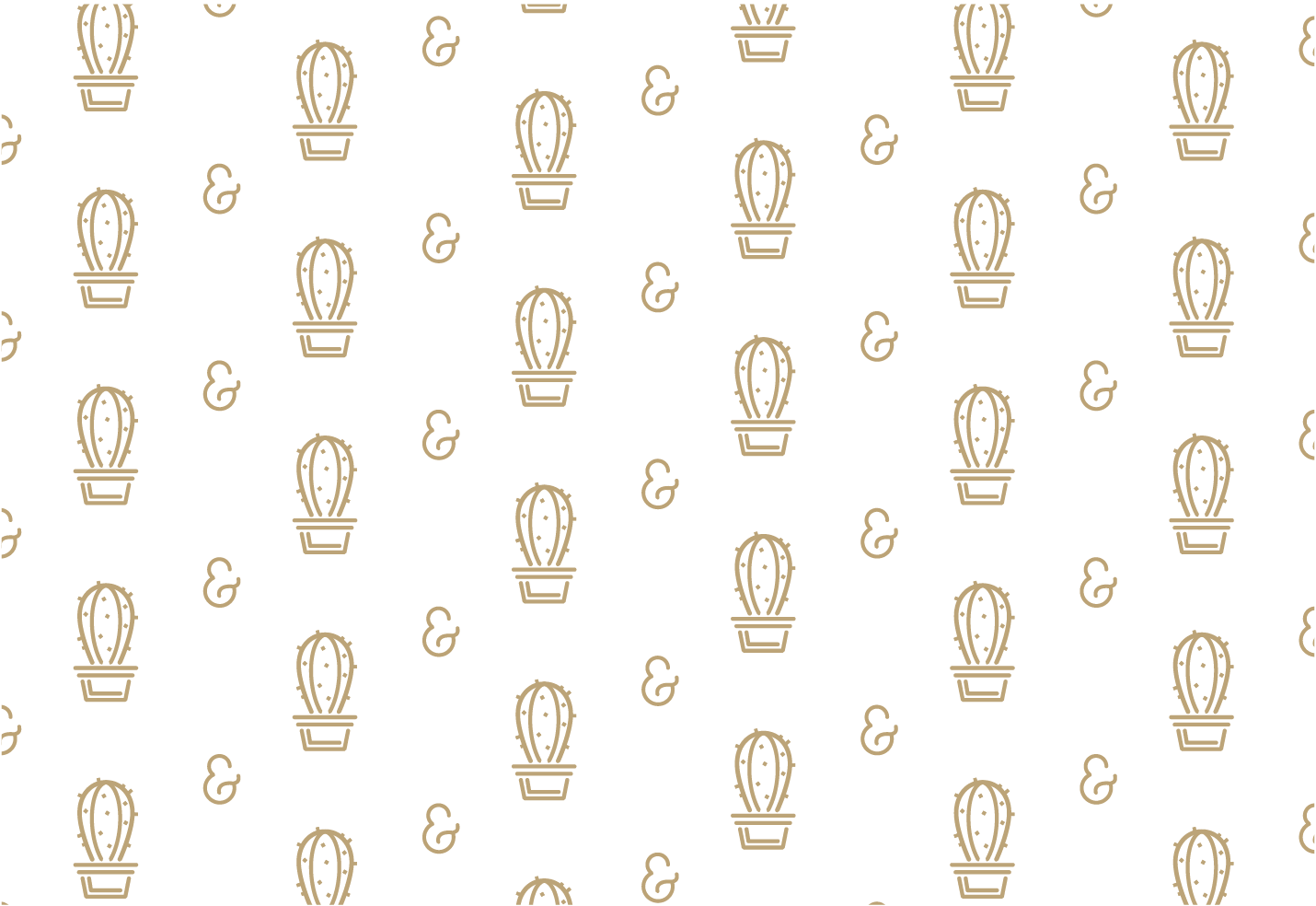
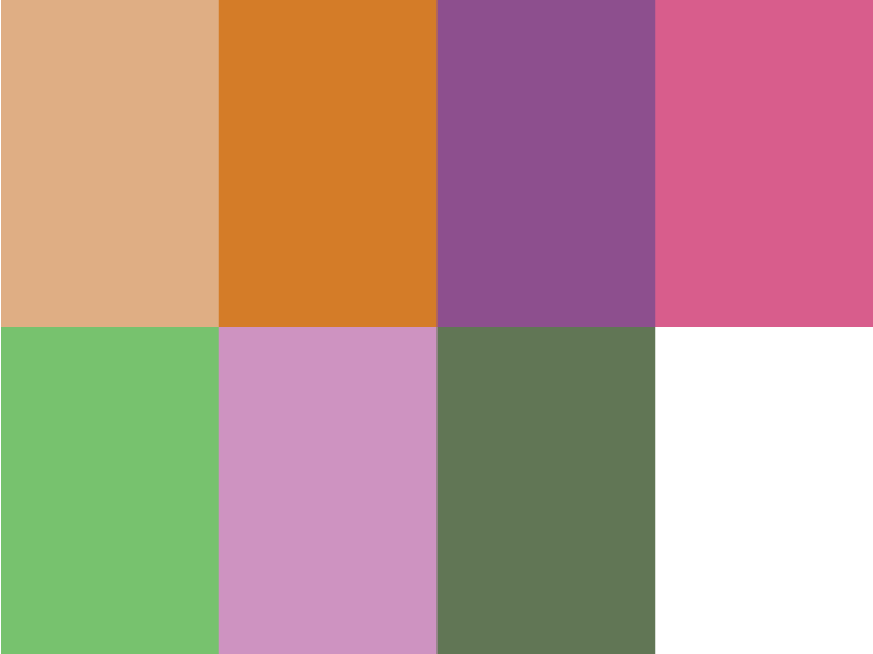
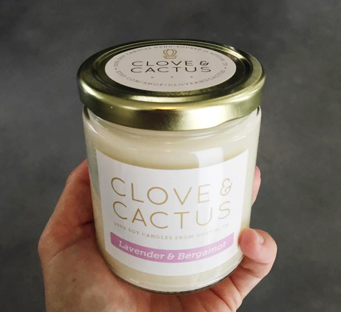
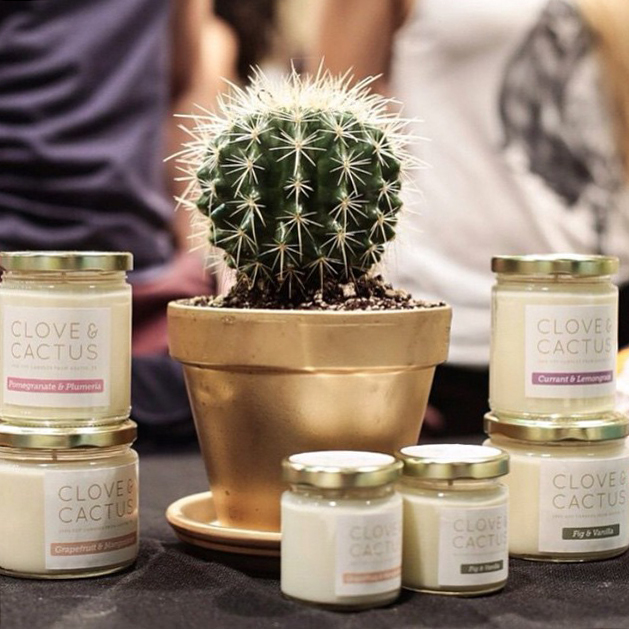
Clove & Cactus
Some friends in Austin asked me to create a brand identity for their candle company. Clove & Cactus make 100% soy hand-poured vegan candles.

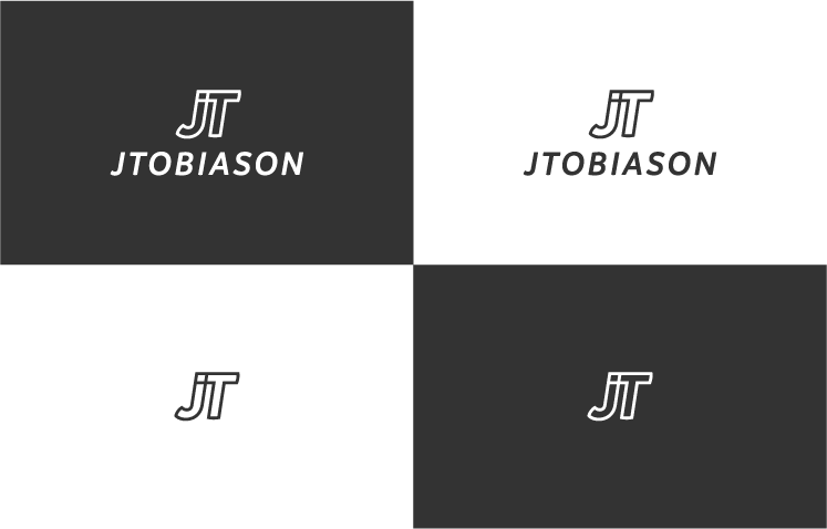
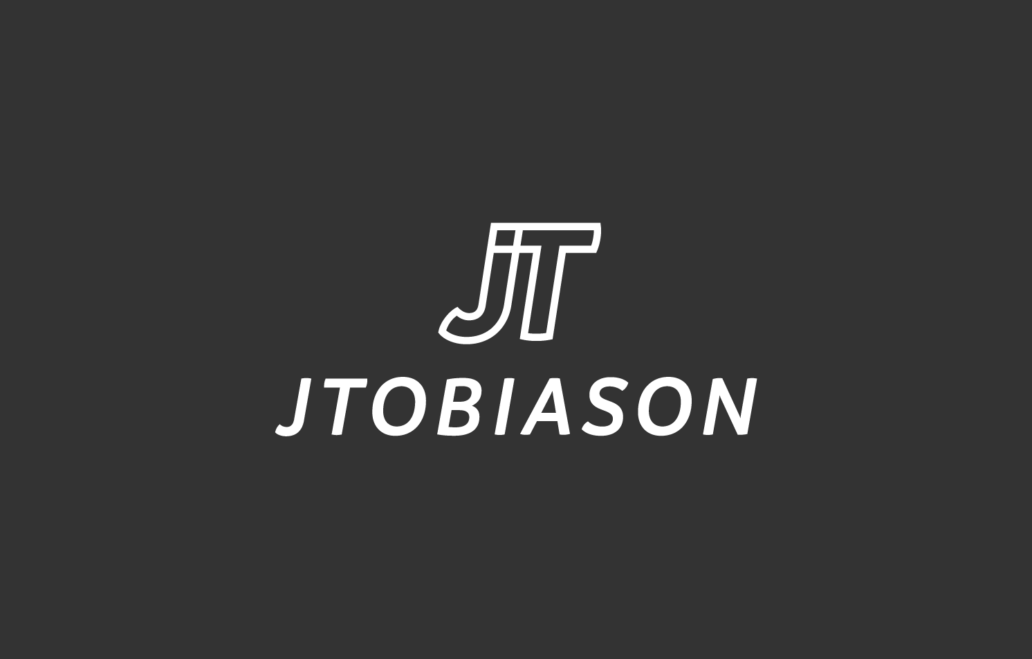
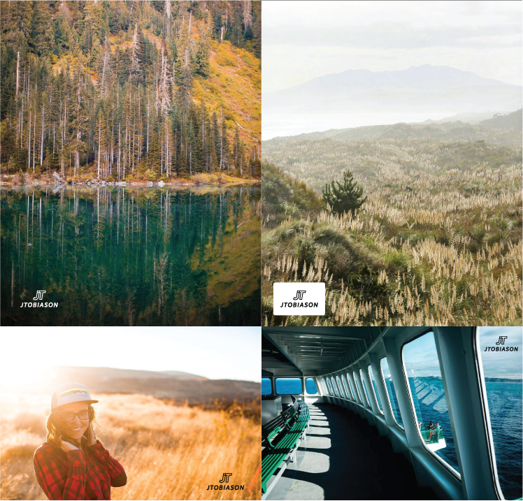
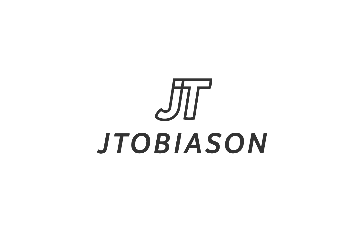
Joe Tobiason Photography
I love working with photographers and other creatives at my letterpress print shop. When Joe Tobiason came to us to design his new client package, he was in the middle of rebranding his photography company, but was stuck mid-process. We first talked through his established brand identity and reviewed his existing ideas so I could craft a new logo mark that fit his fresh and modern aesthetic.
Precision vertical
Precision Vertical offers highly specialized training and consulting for working at heights. We created a clean and flexible mark that would work well across the multiple industries Precision Vertical serves.